Highways: The Dichotomy of the Technocene
Presented by: Polly Ren, Ellen Ma, Carolina Noguera
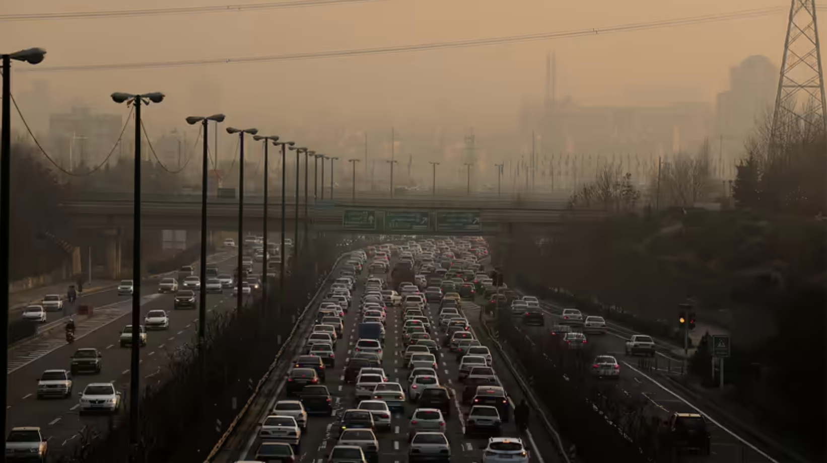
The story of the Technocene is a story of dichotomies, the dichotomy between the built-up environment and the surrounding nature, between rich and poor communities, and between the hustle and bustle of the urban systems and the peace and serenity of protected wilderness. We focus on highways and nearby impaired waters to show this dichotomy in the Technocene, as these highways serve as the foundation of the Technocene. They enable people, goods, and services to travel across state borders. They enable technology to flourish and economies to expand. At the same time, these highways serve as avenues for pollution to spread and for inequalities to exacerbate. As our project explores the relationship between the highways and the nearby 3/4 Coast, it becomes evident that they epitomise the complex dualities that are intrinsically linked to the Technocene.
We use the Technocene framework to evaluate how the anthropogenic creation of transportation infrastructure impacts different geographical regions. Extensive freeways negatively affect some spots more than others. Considering why allows us to conceptualize the mapping of roads as an evaluation of public policy, equity, and regional power dynamics. Further, we see the Technocene infiltrate the natural geological landscape: roads generate technological “debris" or pollutants found in impaired waters. Viewing the landscape through the Technocene, we also see contrasts amongst different groups’ movements and livelihoods. The framework reflects on how technology in urban infrastructure exacerbates injustice. Who gets agency in a newly morphed environment? Whose mobility is prioritized? Who faces the greatest impact of industrialization, and who benefits from it? In answering these questions, there exists disparities not only amongst our own communities, but also between humans and other species. For instance, parks along the Illinois coast of Lake Michigan as opposed to industrial establishments along the Indiana coast may mean Chicago residents have greater access to green space. However, some Chicagoans may face greater consequences of pollution within their own neighborhood. The aquatic organisms of Lake Michigan are also subject to pollutants from every neighboring region, highlighting the importance of stricter nationwide regulation of water contamination. Ultimately, the story of the Technocene is a story of these tradeoffs and dichotomies.
Impaired Waters
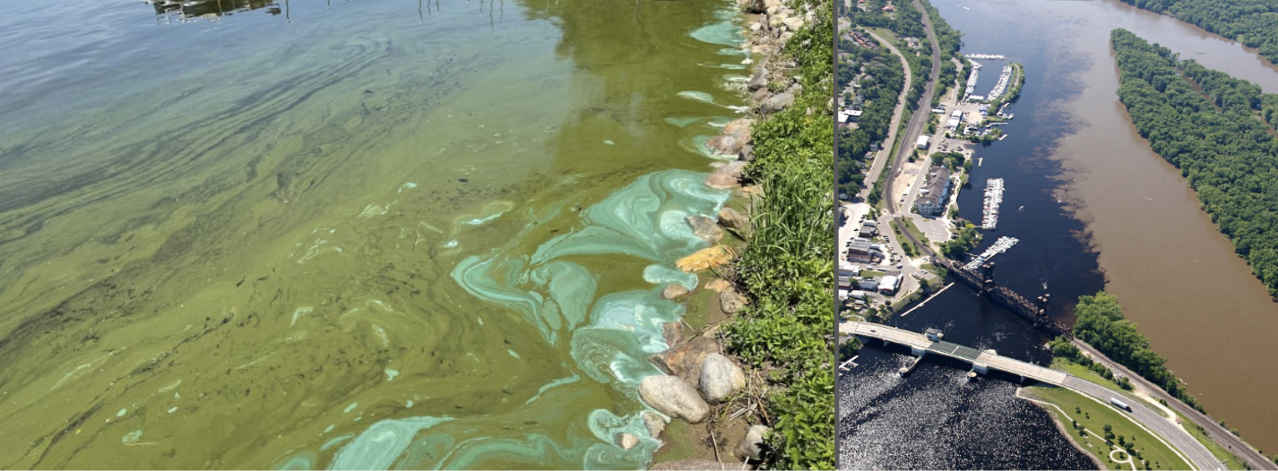
(left) Highly turbid water is marked as impaired in Minnesota. (right) The intersection of rivers in Minnesota shows the contrast in water quality between agriculture-dominated areas and more natural areas.
The Clean Water Act, passed by Congress in 1972, establishes the basic structure for regulating surface water quality. Impaired waters refer to waters that do not meet the Environmental Protection Agency (EPA)’s water quality standards. These impairments are related to the amount of pollution that has occurred in or near the water body, and are typically attributable to “sediment, pathogens, nutrients and metals" from infrastructure such as highways, airports, and industrial facilities, as well as events such as oil spills and hazardous substance releases (EPA). Section 303(d) of the EPA’s Clean Water Act requires states to submit their list of impaired waters every two years for EPA approval, along with the pollutant causing the impairment. Once a water body is added to this list, the state must develop a Total Maximum Daily Load (TMDL) for it, subject to the approval of the EPA, based on factors such as the severity of the pollution and the uses of the water. Then, the water body is tracked by the EPA until the water is fully restored.
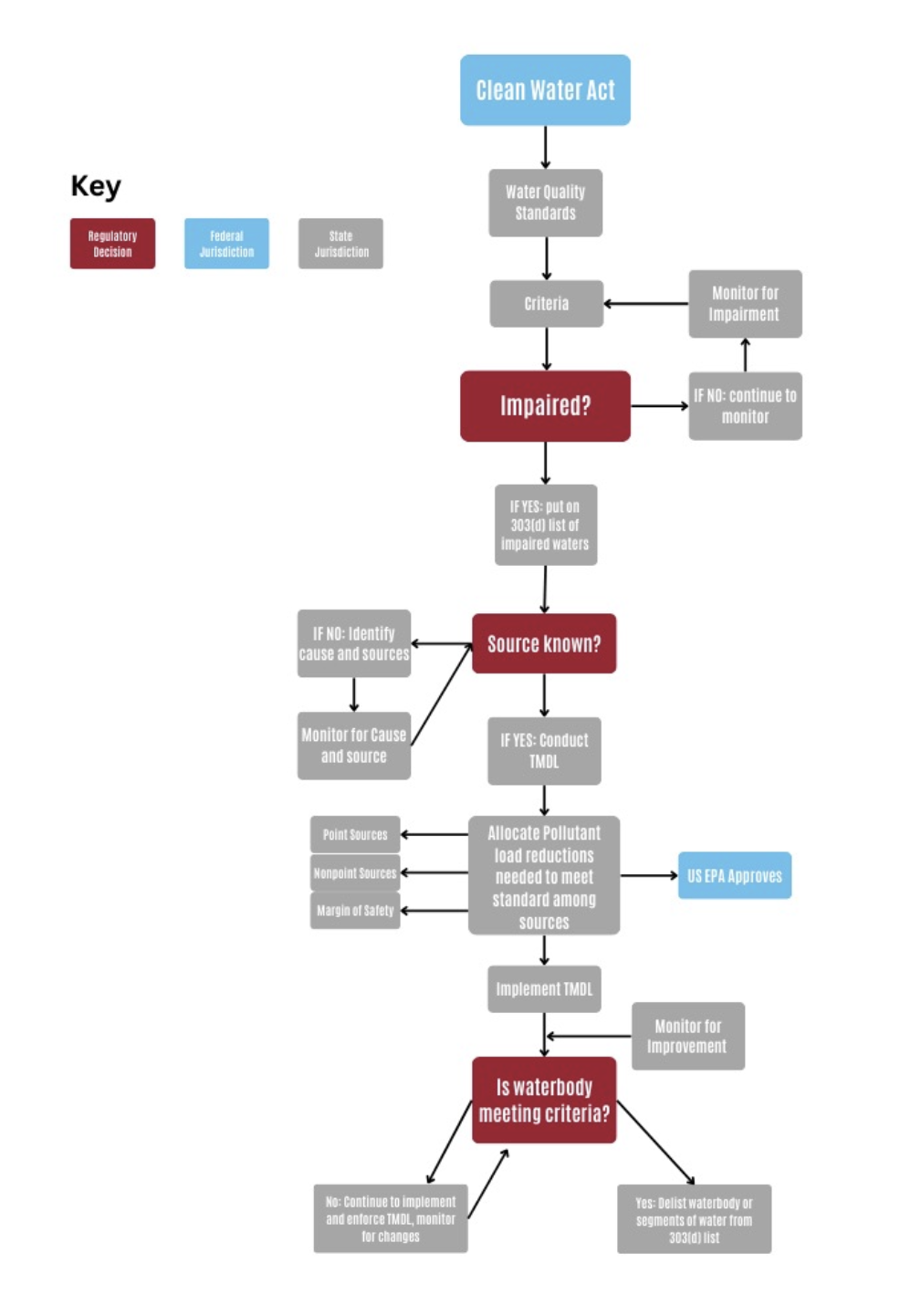
Noguera, Ren, Ma. "System Diagram"
Figure 1: System diagram on how impaired waters are classified, based on the Clean Water Act Section 303(d).
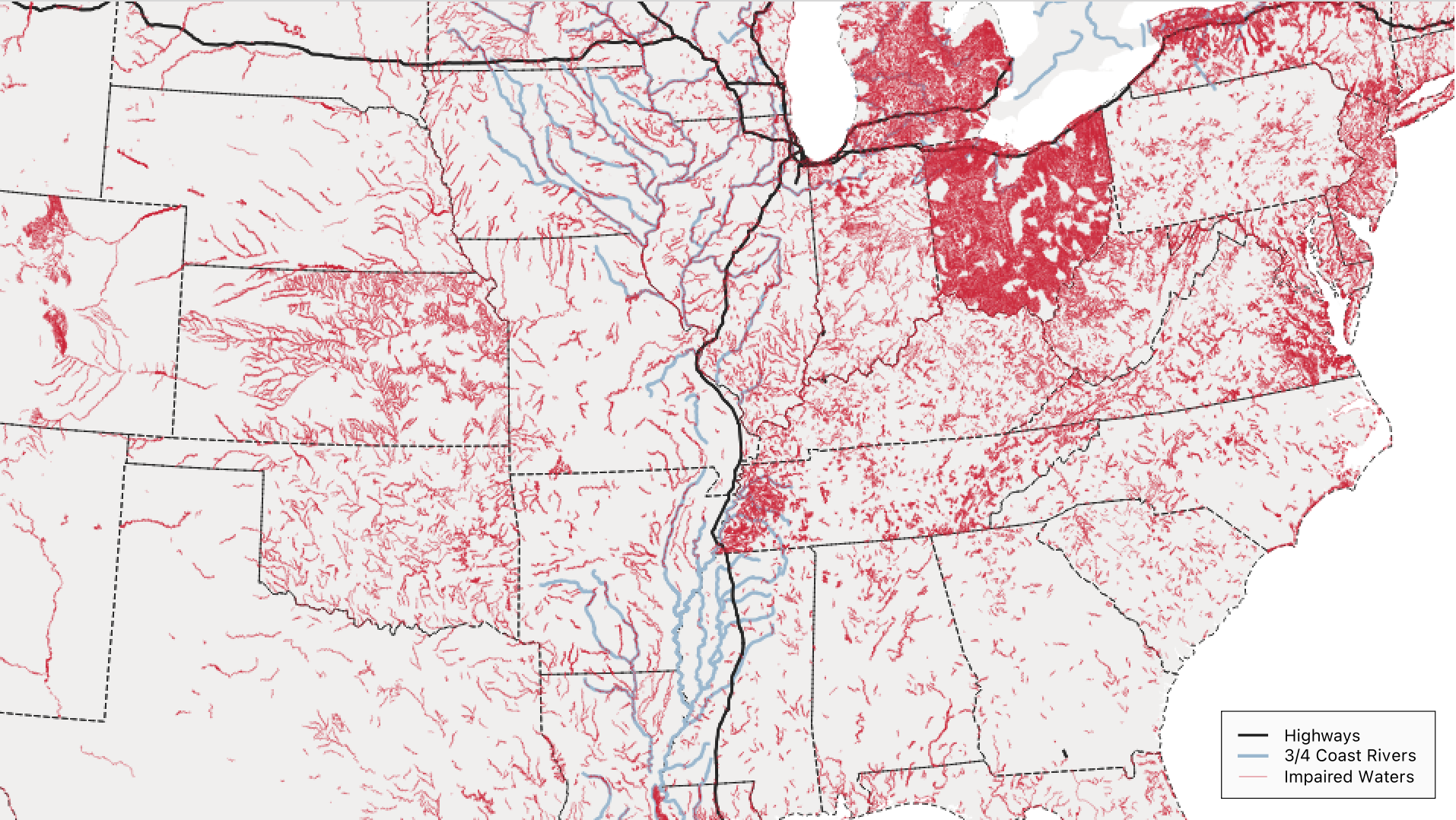
Ren, Ma, Noguera. "Impaired Waters in the United States"
Figure 2: Map of all US impaired waters. This map shows impaired waters as marked by the EPA in 2015, as well as the surrounding watersheds of the 3/4 Coast. Ohio and Michigan have a noticeably higher concentration of impaired waters than the surrounding region due to a history of oil and chemical spills. We will analyse the relationship between these impaired waters and the highways that traverse the 3/4 Coast.
Dichotomy: Built-up Surfaces and Nearby Impaired Waters
Built-up surfaces are defined by the presence of buildings and are a cornerstone to the urban environment. They can be used as an indication of urbanisation and changes in land usage. Areas with taller buildings exhibit greater build-up, whereas natural green spaces typically have limited build-up.
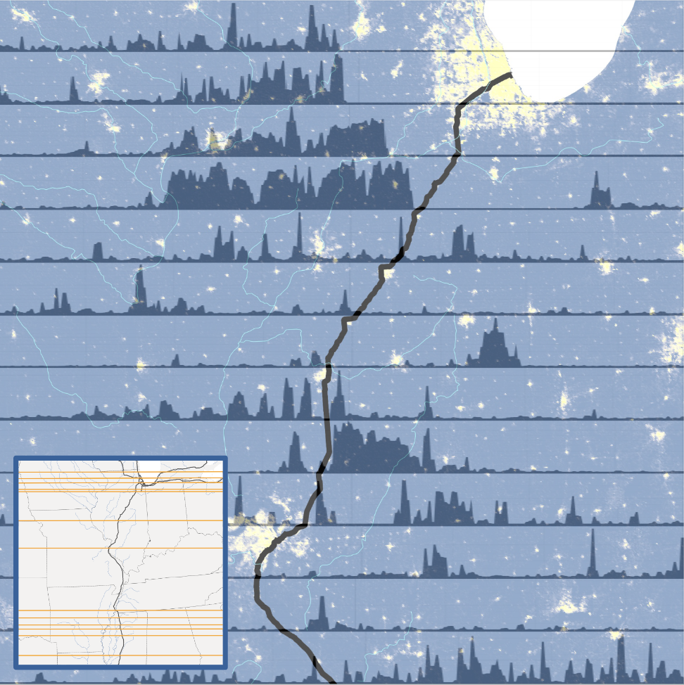
Ren, Ma, Noguera. "Build-up along I-55 Sections"
Figure 3: This map shows the amount of build-up at various points along the I-55 going from Illinois to Louisiana. Horizontal section cuts are made at intersections between the I-55 and a body of water in the 3/4 Coast such that the I-55 is centred along the cut. The minimap shows the cuts at where the build-up is measured along the highway.
One could reasonably expect that the build-up would be roughly similar along a highway, however, this map emphasises that this is not the case. Going down the I-55, we see that there are varying degrees of build-up, even when only cutting at intersections between the highway and a river. There are far more intersections between the highway and rivers in the Illinois area, and there is also far more build-up in this region. South of Illinois, there are sparser conjunctions of highway and water, and even when such conjunctions occur, there is less overall build-up in the vicinity of the highway. This is interesting as it highlights yet another dichotomy that the Technocene presents: the incongruous effects of the Technocene across different regions. It prompts further exploration into the complex interplay between human infrastructure and natural topography, unraveling a narrative of uneven technological influence across geographical regions.
Ma, Ren, Noguera. "Scenographic Map"
Figure 4: Map of built-up surfaces and highway proximities to impaired waters near the Great Lakes basin.
The greater scheme of the map displays highways intertwined with waterways. They can run closely, intersect, or travel parallel to each other. We use pollution as a time scale, as water bodies have been altered from a pre-industrial state of little to no impairment. We perceive the geophysical effects of highways on water bodies, altering their quality or shape. However, studying smaller focal areas intimately involves local communities and neighboring regions within the larger scope or narrative of the Great Basin area. Through the zoom-in, we can discover new agents, actors, and dynamics within our narrative— highways and water bodies are not the only forces involved. Looking more closely constructs new characters and relationships specific to a small-scale space, in a sense creating branching narratives from our central geo-story. This forms our greater perception of industrialization through the lens of highway construction and use, an example of imperial and industrial infrastructure. The smaller narratives share themes of capitalism, power, and state policy in connecting the infrastructure of the 3/4 Coast. Different states manage and alter natural space in various ways, and urban planning exacerbates income inequities.
Organizing the scenographic map with layers reflects the message of our framework. Each layer tells a different story, and combining layers prompts new questions or investigations. For example, the built-up raster tells where urbanization is centered, while the impaired waters to interstate highways distance raster shows where water pollution is most correlated to car-centric transportation infrastructure. Combining the two layers raises questions about the extent to which infrastructure-induced pollution is related to human occupation and the metropolis. We make a similar analysis by combining census data on median family income and the distance raster of impaired waters to highways. We can visualize which socioeconomic levels are most affected by water pollution caused by highway infrastructure. Distance becomes an evaluation of the extent of impact—populations closer to impaired waters are more exposed to pollution, and their wellbeing may be neglected in policy and regulation. The aesthetic attunement of collage photography enhances the visualization of the rasters, making the data more significant and impactful. The map becomes better built for a public audience and is easier to comprehend. The spatial “grammar" of overlapping layers and utilizing different color schemes visualizes relationships between existing natural waterways and newly built man-made paths.
Our scenographic map unfortunately makes other species and their changing ecological spheres invisible. It would be interesting to probe how aquatic ecosystems are impacted by the built environment. We could have added additional data on changing landscapes and invasive species, but we did not want the expansion of considered agents to detract from the sociopolitical focus of our map. We prioritized highlighting the capitalist and policy-dependent power dynamics ruling the Technocene. Other roads and highways that are not major interstates were also omitted, and these pathways equally alter visualizations and geographies. However, we wanted to focus on the interstates and isolate the shown region from the existing dataset to connect the Great Basins of the 3/4 Coast. Finally, the map lacks a time scale in which we could evaluate which water bodies were once polluted and then remediated in history (i.e. Michigan and their prior water contamination crises). We also could not find extensive historical data on how land and waterways were once shaped prior to highway construction. However, the dataset on impaired waters considers a time scale through localizing human impact, evaluating the extent to which aquatic bodies have been altered in recent years. Zoom-ins also spark research into why a geography has specific qualities, and we can search for historical events that explain our visual data.
Illinois: High Build-Up, Contrasting Water Impairment
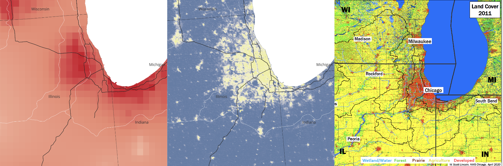
Figure 5: Zoom-in on greater Chicago region in Illinois. (left) Highway proximity to impaired water. (centre) Built-up surface. (right) Illinois land cover.
The dark red spot at O’Hare International Airport means that many impaired waters exist near the roads intersecting this travel hub. With the airport’s commercialist priorities and dense urban population visible, we see the neglect of the environment as an outcome of economic motivations. On the other hand, hardly any impaired waters and built-up space exist going south following the I-55. At this location however, there exists a military base within the Des Plaines Dolomite Prairies. Looking closely, we see that nature is preserved not for environmental conservation, but for security. Although the rasters indicate less contamination and urbanization in this area, it does not mean there is no human impact on this space.
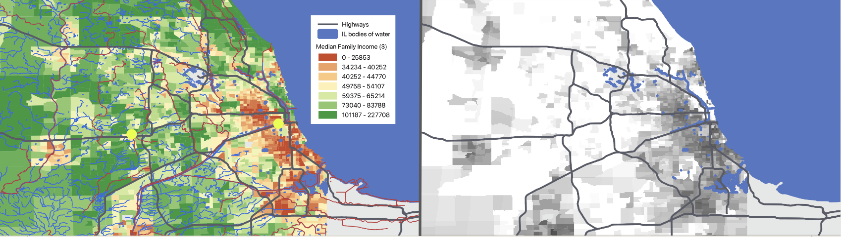
Figure 6: (left) The income raster showing median family income in the greater Chicago area. The red lines are listed as impaired waters by the EPA, whereas the blue lines show the nearby bodies of water. We can see the lower-income communities tend to be closer to impaired water sites. (right) The raster difference between the income raster and proximity to impaired waters in the greater Chicago area. Darker regions have lower median income and are closer to impaired waters, whereas lighter regions enjoy a higher median income and tend to be further away from impaired waters. This shows a clearer distinction between income and proximity to impaired waters.
As explained previously, the highway is designed for the productivity and expediency of commercialism, whether it is transporting products or making one’s commute to work. The capitalist infrastructure of the highway brings injustices across US populations, and the generated map visualises these effects on different regional communities by income levels. The renderings capture social and economic inequities across geographic regions, allowing us to better understand where marginalised communities are most concentrated and how they are impacted by their natural and built environment. This brings awareness to the social consequences of issues such as pollution and industrialisation. Mapping these products of inequity allows us to see that the negative outcomes of capitalist infrastructure are more concentrated in less regulated, more built-up, and lower-income areas. The difference raster emphasises this finding, showing that lower income communities are typically closer to more neglected resources such as impaired waters. In some sense, these communities serve as sacrifice zones that endure constant disinvestment. This is yet another dichotomy that the Technocene creates. While some individuals experience the full benefit of technological advancement, certain groups are left to bear the negative physical and economic consequences that this advancement entails. Ultimately, the extractivist and productivist effects of rapid urbanisation expose power dynamics involved in these geographies, enabling us to see who and what sociopolitically powerful agents prioritise and neglect.
Indiana: Highly Impaired Water from Industrial Facilities
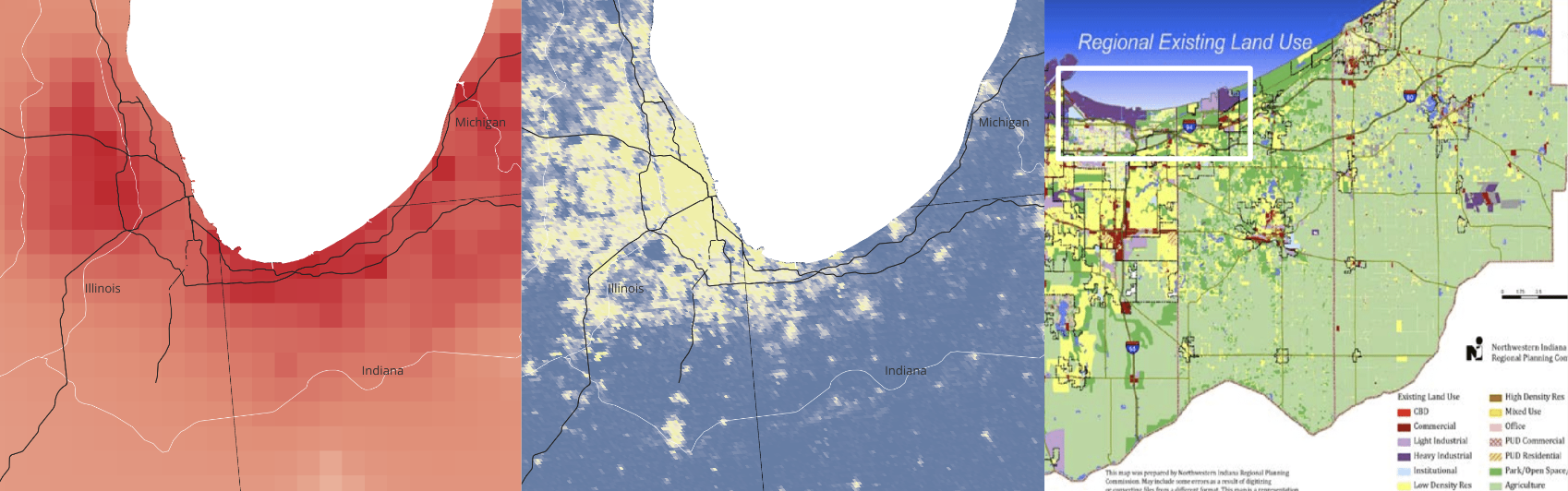
Figure 7: Zoom-in on northern Indiana. (left) Highway proximity to impaired water. (centre) Built-up surface. (right) Indiana existing land usage.
The gray line going down the middle of the map represents the border between Illinois and Indiana. Because there are not many rivers in this close-up, we would like to focus on the shore near Lake Michigan. There exists a stark contrast between the extent of impaired waters along each state’s coastline that seems unusual. While Indiana exhibits more impaired waters, the Chicago coastline is much more built up. Looking closely at the coast on satellite imagery, we see more parks within the Illinois state boundary, while industrial area takes over Indiana east of the Calumet. Therefore, there is less build-up but more impaired waters in Indiana, exposing a difference between substances infiltrating different coastal water bodies and the contrasting state use of coastline space. While Illinois has historically preserved its shoreline and tackled erosion, Indiana has had intensive struggles with urban-industrial land use.
Wisconsin: Low Build-Up, Few Impaired Waters
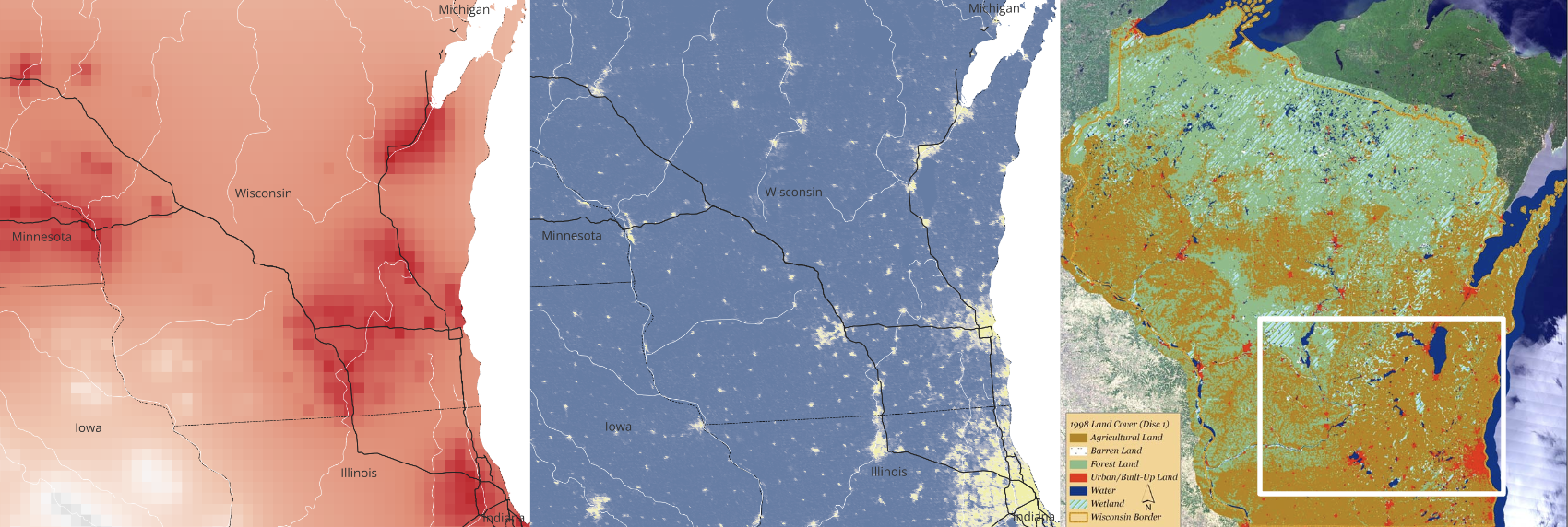
Figure 8: Zoom-in on southern Wisconsin. (left) Highway proximity to impaired water. (centre) Built-up surface. (right) Wisconsin land cover.
Hardly any built-up space is found in Wisconsin except in the major city of Milwaukee, where we also find more impaired waters. In fact, impaired waters extend far past the urban bounds of Milwaukee, showing how human impact on the environment extends past simply occupied or built-up space. This relates to the Technocene’s focus on human-produced debris infiltrating unpredictable parts of our environment. Milwaukee’s visualizations contrast to the rural and suburban areas in the west. As the I-90 and I-94 go up north, there are not many built-up spaces or impaired waters in sight. Contrasting to the urban setting of Milwaukee, this area of Juneau County has a much lower poverty rate and is mostly white. There are also the preserved areas of Riverview Park and Wisconsin River near the I-90. These areas of Wisconsin highlight demographic discrepancies between urban and rural areas, in which higher poverty rates and denser regions have greater impaired waters and less access to natural space. The principles of pollution and the Technocene exacerbate social inequity.
Michigan: Low Build-Up, Highly Impaired Rivers
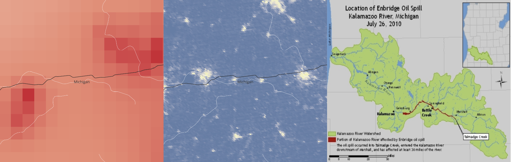
Figure 9: Zoom-in on southwestern Michigan. (left) Highway proximity to impaired water. (centre) Built-up surface. (right) 2010 Kalamazoo River oil spill.
The highway shown is the I-94, and many neighboring rivers cross through the road or run near it. Overall, the region does not exhibit much build-up, and hardly any impaired waters exist near slightly more built-up hubs near the I-94. This can be related to government responses to Michigan’s past water problems, in which the state now has higher surveillance and regulation over water quality. Control over Flint’s water contamination and successful oil containment after Kalamazoo River’s oil spill may be examples in which Michigan has demonstrated resilience and increased caution towards polluted waters. However, zooming out and only looking at the mapped impaired waters, we see that there are actually many impaired water sources independent of nearby highways. The dichotomy of this data visualization shows that even with restoration efforts, Michigan is not resilient enough to completely remediate the damage done to its waters. Technology when utilized in recovery efforts is only so effective, and it ultimately exasperates resources.
Ohio: Industrial Influence on Water Impairment
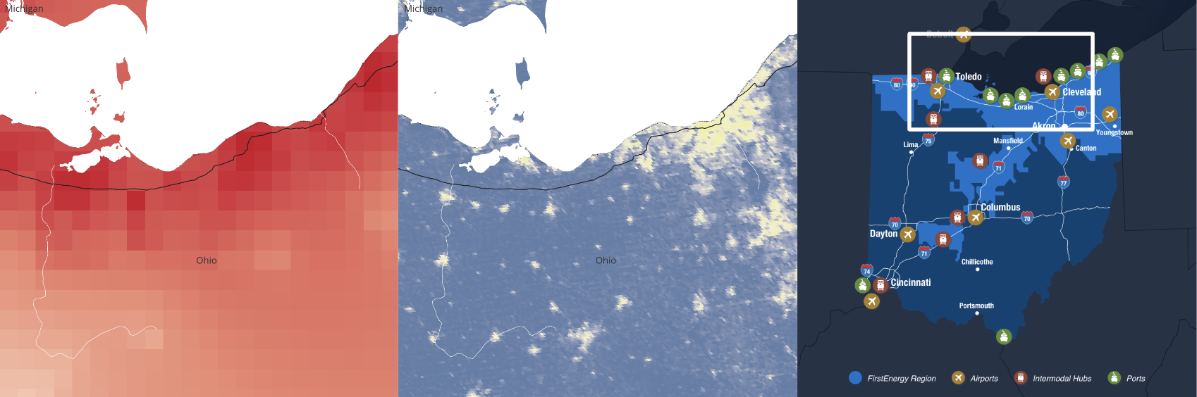
Figure 10: Zoom-in on northern Ohio. (left) Highway proximity to impaired water. (centre) Built-up surface. (right) Major industries in Ohio.
The Cuyahoga River entering Cleveland on the very right contrasts the Sandusky River entering Fremont on the very left of the image. There are slightly less impaired waters and more build up near the Cuyahoga, which may be correlated with Ohio’s greater preservation of the Cuyahoga. There may exist a dichotomy between local and state environmental efforts. While the Cuyahoga has a national park protecting it, the Sandusky River relies on local organizations to better implement nonpoint pollution control programs. However, zooming out on the map of impaired waters, we see a broader story in which Ohio’s impaired waters are found prominently throughout the state. Along the entire coastline, there is a great influence of agriculture runoff and large industries such as Heinz polluting the waters of Lake Erie. Ohio’s water quality efforts are ultimately ineffective.
Dichotomy: Where Highways Meet Water
The confluence of rivers and highways marks a distinct intersection between natural waterways and urban infrastructure. This juncture serves as an interesting lens through which to examine the interplay of the natural and the built environments. This intersection provides a visual and thematic focal point to explore the complex relationship between water bodies and the infrastructure that traverses them.
Noguera, Ren, Ma. "Where Highways Meet Water"
Figure 11: This interactive image portrays our geo-narrative as a combination of various factors creating a correlation between the Technocene and impairment of water bodies. The two regions of interest are locations where there is an intersection between highways and rivers. However, both locations have very different geophysical qualities, particularly in relation to their surrounding impaired waters.
O'Hare International Airport
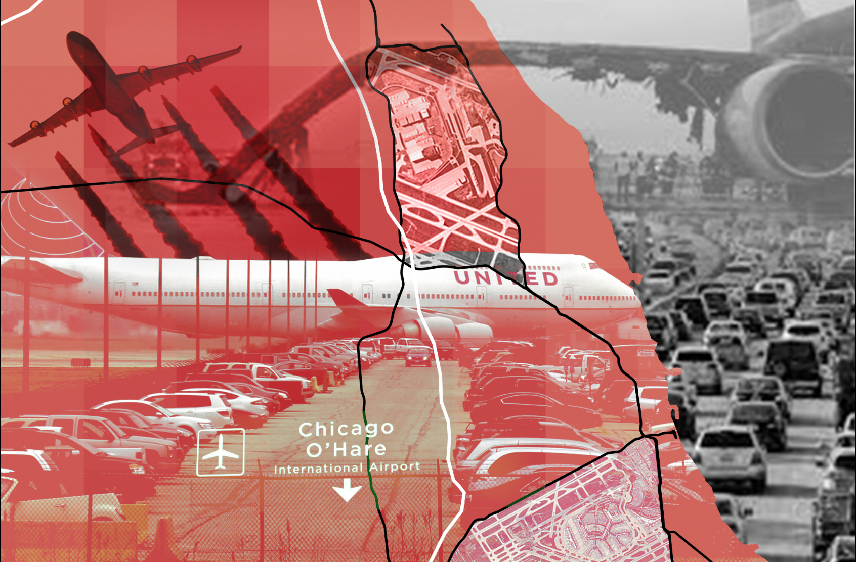
Figure 12: Collage of I-90 x I-294 x Des Plaines River x O'Hare
In the image representing that of the intersection between I-90, I-294 and the Des Plaines River, upon investigation, we discovered this was the location of O'Hare International Airport. As can be seen in our general map, there is high water impairment in this part of the river, represented by the dark red color. We wanted to ensure this was seen in the visual media, so we used an overlay in photoshop to incorporate the distance raster layer to the whole image. Each image incorporated into this collage was selected to serve a specific purpose. We used blending modes to create different effects, such as the plane on the top left corner becoming a dark shadow to represent the damaging, stark effects of pollution that airplanes create. There are two aerial view images of the airport, which are clipped to areas of the highways in two different sections, to represent the high quantity of built-up, impearmeable surfaces in this area due to the massive airport. There two images of cars, one of the full airport parking lot and one of the traffic on the way into the airport, to represent the fact that this international airport, having an average of over 850 flights per day, is heavily trafficked as cars come in and out to drop off and pick up passengers all day, every day. Of all airlines, United has the most flights daily from O’Hare, which is why we chose the image of a United flight, to convey their impact. Finally, the daunting image of the burnt airplane on the right side of the image is there to represent the O’Hare Airport runway fire from October 2016. This was a significant event in water pollution in the area because the fire was put out using AFFF foam, which is now being phased out, contains toxins called forever chemicals. These chemicals have severe health threats, including various cancers, liver damage, low birth weights, among other health implications. The most concerning part about these chemicals is that they are extremely difficult to clean out of a water body thats been contaminated. This event led to groundwater contamination beneath and around the O’Hare international airport, and the national estimate to clean this up was $39 billion. A large airport such as this one holds many different pollution factors and risks associated.
Des Plaines Dolomite Prairies Land and Water Reserve
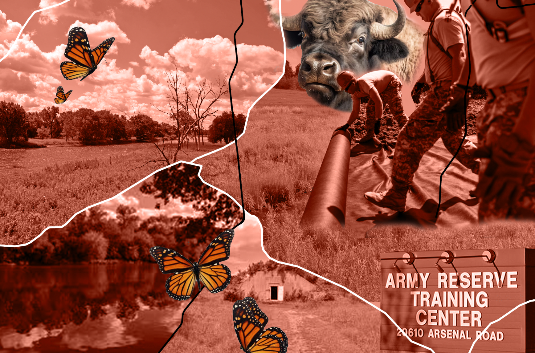
Figure 13: Collage of I-55 x Des Plaines and Kankakee Rivers x Midewin Prairie x Joliet Local Training Area
In the second collage, we see the very low frequency of impaired waters close to the highways where I-55 and the Des Plaines and Kankakee Rivers both intersect with one another. We want to call attention to the clear correlation between land use and water quality. Upon investigating this region, we discovered that the area is home to the Des Plaines Dolomite Prairies Land and Water Reserve, the Midewin National Tallgrass Prairie, and the Joliet Army Reserve Training Center. All three of these places protect the land around them, and have few impermeable surfaces, as they have a lack of build-up. The preservation of this region's natural environment supports the higher water quality of the two rivers here. The Midewin National Tallgrass Prairie was formerly the Joliet Arsenal, but has now been reclaimed by nature, allowing native species to thrive here, such as the buffalo, becoming the first national tallgrass prairie in the United States. The Des Plaines Dolomite Prairies Land and Water Reserve has an area of over 5,000 acres, including approximately 200 acres of water, protecting these regions. Within this collage, the color overlay to represent the distance raster remains, but we decided to have the native species in their natural color. In addition, there were a few more artistic elements to create a more soft look, such as the soft brush when creating masks, so as to convey the feeling that this area is “good" for the environment, a clear difference from the blunt, harsh lines of the previous collage, where there is a lot of environmental damage.
Works Cited
“About – Conservancy for Cuyahoga Valley National Park." Accessed December 2, 2023. https://www.conservancyforcvnp.org/about/.
CurrentOps.com. “Joliet Army Reserve Training Center." CurrentOps.com. Accessed December 7, 2023. https://currentops.com/installations/us/il/joliet-army-reserve-tng-ctr.
“Des Plaines State Fish and Wildlife Area." Illinois Department of Natural Resources. Accessed December 2, 2023. https://dnr.illinois.gov/parks/park.desplaines.html.
Fairclough, Ian. “Monarch Butterflies." SaltWire, August 13, 2022. https://www.saltwire.com/atlantic-canada/news/people-shouldnt-interfere-with-monarch-butterflies-at-any-life-stage-biologist-100762950/.
HISTORY. “The Interstate Highway System - Definition, Purpose & Facts," June 7, 2019. https://www.history.com/topics/us-states/interstate-highway-system.
HowStuffWorks. “How Much Air Pollution Comes From Cars?," August 29, 2012. https://auto.howstuffworks.com/air-pollution-from-cars.htm.
Illinois.gov. “State Tackling Harmful Lake Michigan Shoreline Erosion at Illinois Beach State Park," January 12, 2023. https://www.illinois.gov/news/press-release.html.
Jansen, Larry Copeland and Bart. “You’ve Been Warned: The Worst Times to Travel to the Airport." CNBC, December 19, 2012. https://www.cnbc.com/id/100327696.
Kalamazoo River Watershed Council. “Oil Spill." Accessed December 2, 2023. https://kalamazooriver.org/learn/what-are-the-problems/oil-spill-2.
Mayer, Harold M. “Politics and Land Use: The Indiana Shoreline of Lake Michigan." Annals of the Association of American Geographers 54, no. 4 1964: 508–23. https://www.jstor.org/stable/2561743.
“Midewin National Tallgrass Prairie - Home." Forest Service National Website. Accessed December 2, 2023. https://www.fs.usda.gov/midewin.
OEHHA. “Impaired Water Bodies." Accessed December 7, 2023. https://oehha.ca.gov/calenviroscreen/indicator/impaired-water-bodies.
“O’Hare International Airport." Wikipedia, December 7, 2023. https://en.wikipedia.org/wiki/O%27Hare_International_Airport.
Photos of Des Plaines Dolomite Prairies Land and Water Reserve. Accessed December 8, 2023. https://www.alltrails.com/parks/us/illinois/des-plaines-dolomite-prairies-land-and-water-reserve/photos.
Press, Associated. “Plane Fire on O'Hare Runway Caused by Serious Engine Failure: Official." New York Post, October 29, 2016. https://nypost.com/2016/10/29/plane-fire-on-ohare-runway-caused-by-serious-engine-failure-official/.
ResearchGate. “Benthic macroinvertebrates as indicators of water quality: The intersection of science and policy." Accessed December 7, 2023. https://www.researchgate.net/figure/Policy-framework-describing-the-process-to-implement-the-Clean-Water-Act-Specifi-cally_fig1_233686971.
Ruckart, Perri Zeitz, Adrienne S. Ettinger, Mona Hanna-Attisha, Nicole Jones, Stephanie I. Davis, and Patrick N. Breysse. “The Flint Water Crisis: A Coordinated Public Health Emergency Response and Recovery Initiative." Journal of Public Health Management and Practice : JPHMP 25, no. Suppl 1 LEAD POISONING PREVENTION 2019: S84–90. https://doi.org/10.1097/PHH.0000000000000871.
Sandusky River Watershed Coalition. “About Us," March 5, 2018. https://sanduskyriver.org/about-us/.
Schulte, Erin. “Forever Chemicals’ Toxic Legacy at Chicago’s Airports." Inside Climate News, November 10, 2023. https://insideclimatenews.org/news/11112023/chicago-ohare-airport-pfas.
Thoel, Sean. “Full Metal Prairie." Edge Effects, October 12, 2019. https://edgeeffects.net/midewin/.
“TIGER Shapefile, 2019, Nation, U.S., Primary Roads National Shapefile." Data.gov. Accessed December 7, 2023. https://catalog.data.gov/dataset/tiger-line-shapefile-2019-nation-u-s-primary-roads-national-shapefile.
U.S. Census Bureau. “QuickFacts: Juneau County, Wisconsin." Accessed December 2, 2023. https://www.census.gov/quickfacts/fact/table/juneaucountywisconsin/PST045222.
US EPA, OP. “Summary of the Clean Water Act." Overviews and Factsheets, February 22, 2013. https://www.epa.gov/laws-regulations/summary-clean-water-act.
US EPA, OW. “Clean Water Act Section 303d: Impaired Waters and Total Maximum Daily Loads TMDLs." Collections and Lists, September 26, 2014. https://www.epa.gov/tmdl.
US EPA, OW. “Impaired Waters and Stormwater." Overviews and Factsheets, July 28, 2015. https://www.epa.gov/tmdl/impaired-waters-and-stormwater.
US EPA, OW. “Overview of Listing Impaired Waters under CWA Section 303d." Overviews and Factsheets, September 29, 2015. https://www.epa.gov/tmdl/overview-listing-impaired-waters-under-cwa-section-303d.
US EPA, OW. “WATERS Geospatial Data Downloads." Data and Tools, January 20, 2015. https://www.epa.gov/waterdata/waters-geospatial-data-downloads.
US EPA, REG 05. “Lake Erie." Overviews and Factsheets, September 16, 2015. https://www.epa.gov/greatlakes/lake-erie.
Virginia DEQ. “Water Quality ." Accessed December 7, 2023. https://www.deq.virginia.gov/our-programs/water/water-quality.